Website Design Boot Camp Part 2: Website Design

Last week we looked at the purpose of a website. Now it’s time to get to the nitty-gritty of actually building a powerful website. That means creating a great customer experience on your website as well as a coherent path to convert visitors into customers. Let’s look at some of the fundamentals of website design: structure, navigation, and layout.
Site Structure & Navigation
At the heart of your website design has to be a well-thought out site structure and navigation. Simply put, what pages are you going to include on your website, and how are the pages organized? How do you get from one page to another, and how do the various pages flow together to tell the story of your business to brand new visitors and loyal customers alike?
Of course you have the home page, and you absolutely must include pages for contact information and for information about the business—“Contact Us” and “About Us” pages. But what else do you need? It will largely depend on your business. Look at the websites of other companies in your industry to get an idea of what types of pages others are including. Almost every restaurant includes a “Menu” page, for example, while professionals will share personal bios with their credentials. Other pages might outline different services and service levels, while others might include case studies and testimonials.
Free Download: Analyzing Google Analytics
Categorize all the information you will include on the site into a few main menu items. You only want a few menu items so that visitors are not overwhelmed by options when they land on your site. Use sub-items to organize all the various information you’re including on the site. It should be obvious what visitors will find whenever they begin navigating within any of the menu items, making it easy for them to find whatever they’re looking for or to jump from category to category.
A typical navigation menu might include a link back to the home page, as well as items for “About Us,” “Contact Us,” a product or service list, testimonials, and a blog. A simple site might just have one page for each of those menu items, or a complex one might include submenus and dozens of pages—but the number of pages is less important than the organization of those pages.
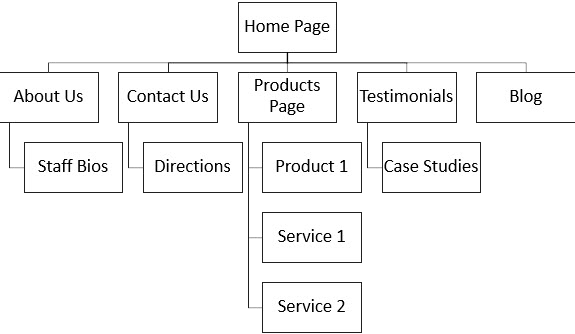
Consider building a chart that includes all the pages on your website, and shows how to get from one to the next, like this one:
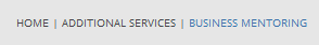
If you have many pages on your site, you should further help visitors with navigation and site structure by including “breadcrumbs.” This shows visitors what page they are on, and how they got there.
In this example from GoSmallBiz.com, the visitor is on the “Business Mentoring” Page, a subpage under the “Additional Services” menu item. A visitor can also return directly to the home page.
With clear structure and navigation, you create a great customer experience, because visitors know exactly what they’re looking at, and how to find what they want. When a site has poor structure and navigation, visitors often decide it’s easier to just find another business than to figure out how to find what they need.
As an example of an easy-to-follow page structure, see how we’ve laid out our navigation menu on GoSmallBiz.com:

Page Layout
Now it’s time to design the actual pages of your website. The first thing to keep in mind is consistentency; pages should have a similar look and feel so that visitors will know where to find things. This means keeping your menu consistent across the pages of your site (with some variations for displaying submenus or limiting options on individual landing pages), and using consistent placement of text, images, and other information. If your menu is running across the top on one page, with the copy below, don’t randomly switch to a side menu on another page. The pages may change, but visitors should still know exactly where everything is or will be. Where is the menu, where is the copy, is there a hero image or a media player? Is the focus on media with supportive copy, or copy with supportive images? Sketch out where the information on your pages will go. Keep every element in balance: a good website design, like design in any creative field, depends on balance.
Display is a related issue. Today’s consumers aren’t visiting websites on just one kind of device. Gone are the days when you could assume someone would be looking at your site on a full-size computer screen. They still might! But they just as likely are using something else. A website that looks beautiful on a 20-inch high-definition monitor is going to look a lot different on a 3.5-inch iPhone 4S screen. And while the difference might not be as dramatic as that, a 15-inch laptop is still going to display differently from a tablet.
Your website is your handshake- is it helping or hurting? Get a free site analysis from our web design experts.
The solution is to build a site that uses responsive design. Simply put, a site with responsive design adjusts its display based on the size of the user’s screen. Everything is flexible and proportional, to size up or down as needed, rather than fixed to look perfect at only one size.
Microsoft.com/stories is a great example of a balanced website design:
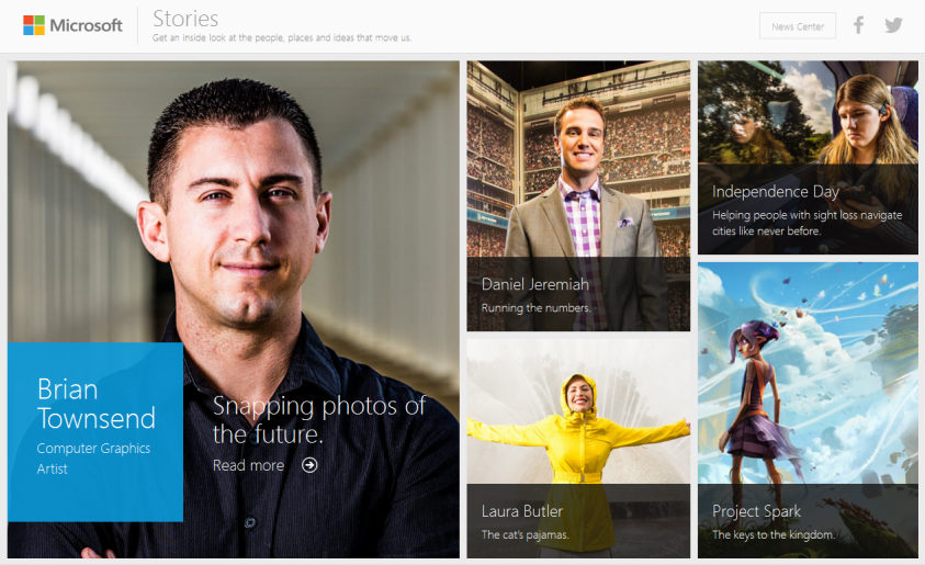 Microsoft.com/stories is a website that puts a face to the giant corporation through stories of their employees and their initiatives. The layout of this page is simple and elegant. Microsoft draws your attention to the page’s featured story by placing it where visitors tend to look first (upper left-hand corner) and by giving it the largest image on the page. Also, note how all three columns (the featured story and both rows of satellite stories) end at the same spot- which is visually pleasing. Lastly, notice how they don’t distract the visitor with unneeded links or popup messages on this page.
With effective design, your site will provide a better user experience. Everyone who visits the site will intuitively know what they’re looking at, where to go, and how to find what they need.
Do you have questions? Click here for a free website design consultation.
Before next week’s lesson, think about these questions:
✓Can customers navigate your site easily?
✓Do your menus make sense?
✓Does your page layout have structure?
Revisit Lesson 1- Website Purpose
[latest_posts header=”More on Marketing” limit=”” category=”8″]